Even if we don't end up working together, I want to make your visit here is worthwhile. These design guidelines drive the thinking behind any project I take on. Hopefully, they can help you, too.
SAARINEN'S LAW
design holistically
"Always design a thing with the next larger context in mind - a chair in a room, a room in a house, a house in an environment, an environment in a city plan." -- Eliel Saarinen
This advice to architects from the 1920's applies equally so in today's omni-channel environments, where online and mobile technologies are flooding into the store.
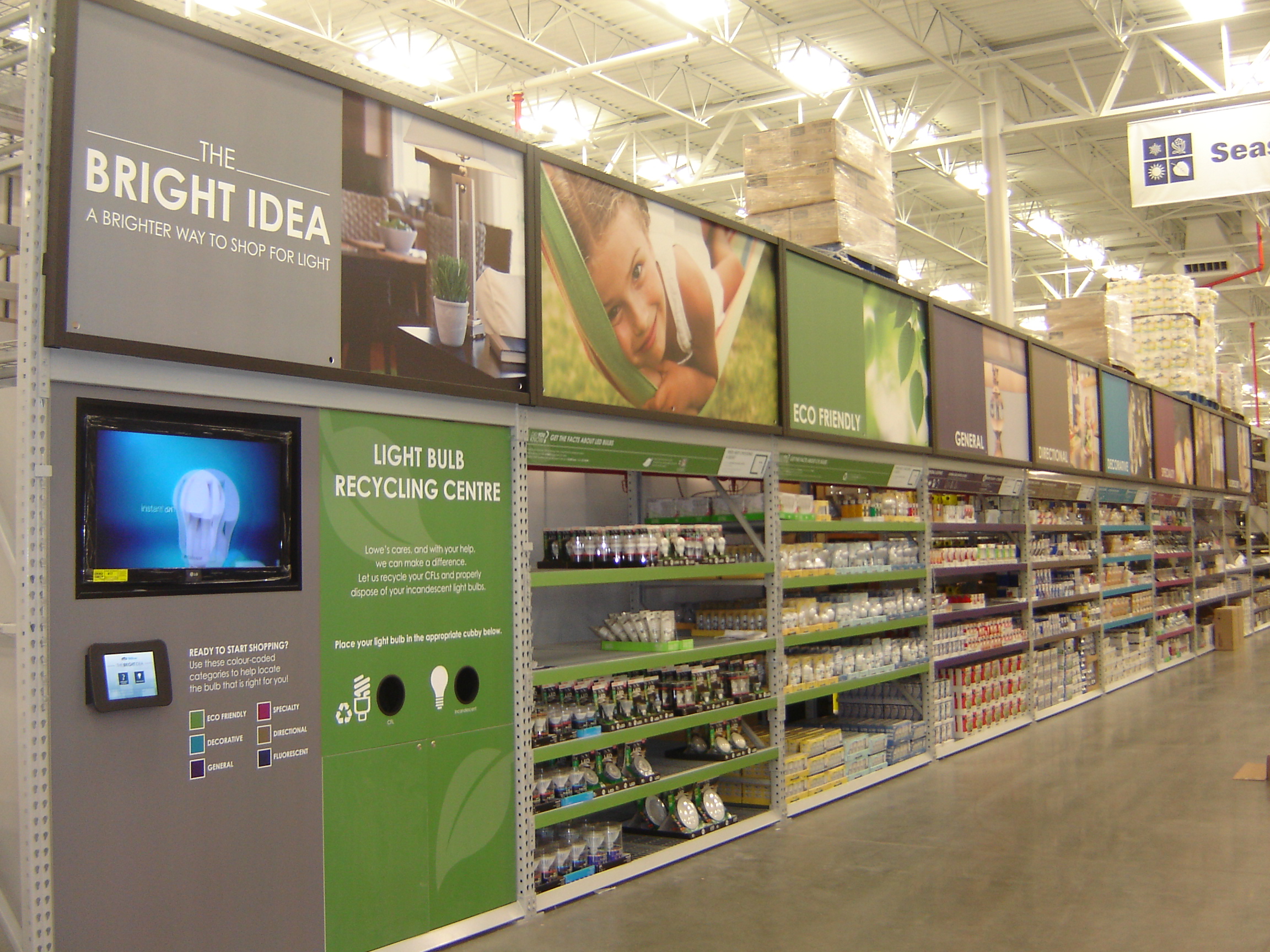
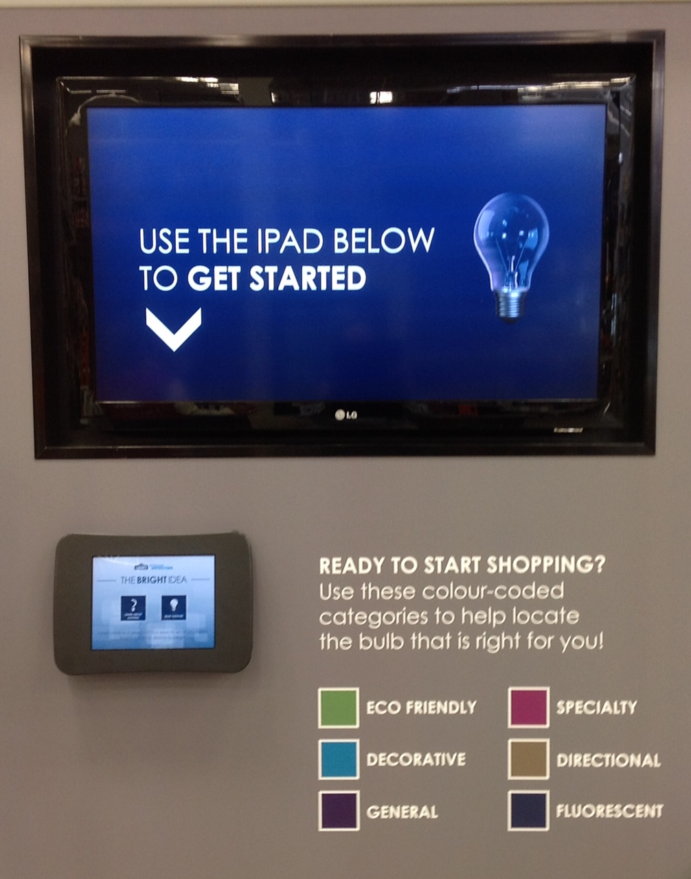
When building customer-facing experiences for the sales floor, even before you start wire-framing, make sure to study the physical environment. Stand 20 feet from where the touch-screen will reside. Notice the site lines. Then 10 feet. Then two. If the display doesn't draw the eye from afar, they'll never get close enough to engage with your app.
Bottomline: Make sure what the shopper sees from a distance syncs up seamlessly all the way through your on-screen user experience.
Tips: Work on the hardware and software simultaneously. And plan to iterate often.
HICK'S LAW
simplify decision making
The path to a purchase is really just a sequence of snappy decisions. If all goes well, you've got a customer. But if the shoppers get overwhelmed or frustrated, they're likely to walk away empty handed.
Hick's Law, a popular reference point for web designers, states that the time it takes to make a decision increases exponentially as the number of options grow. "RT = a + b log2" to be exact.
Tying it back to retail ... the more choices you eliminate; the swifter the route to the register. Now this applies more to steps along the shopper journey than the number of products offered.
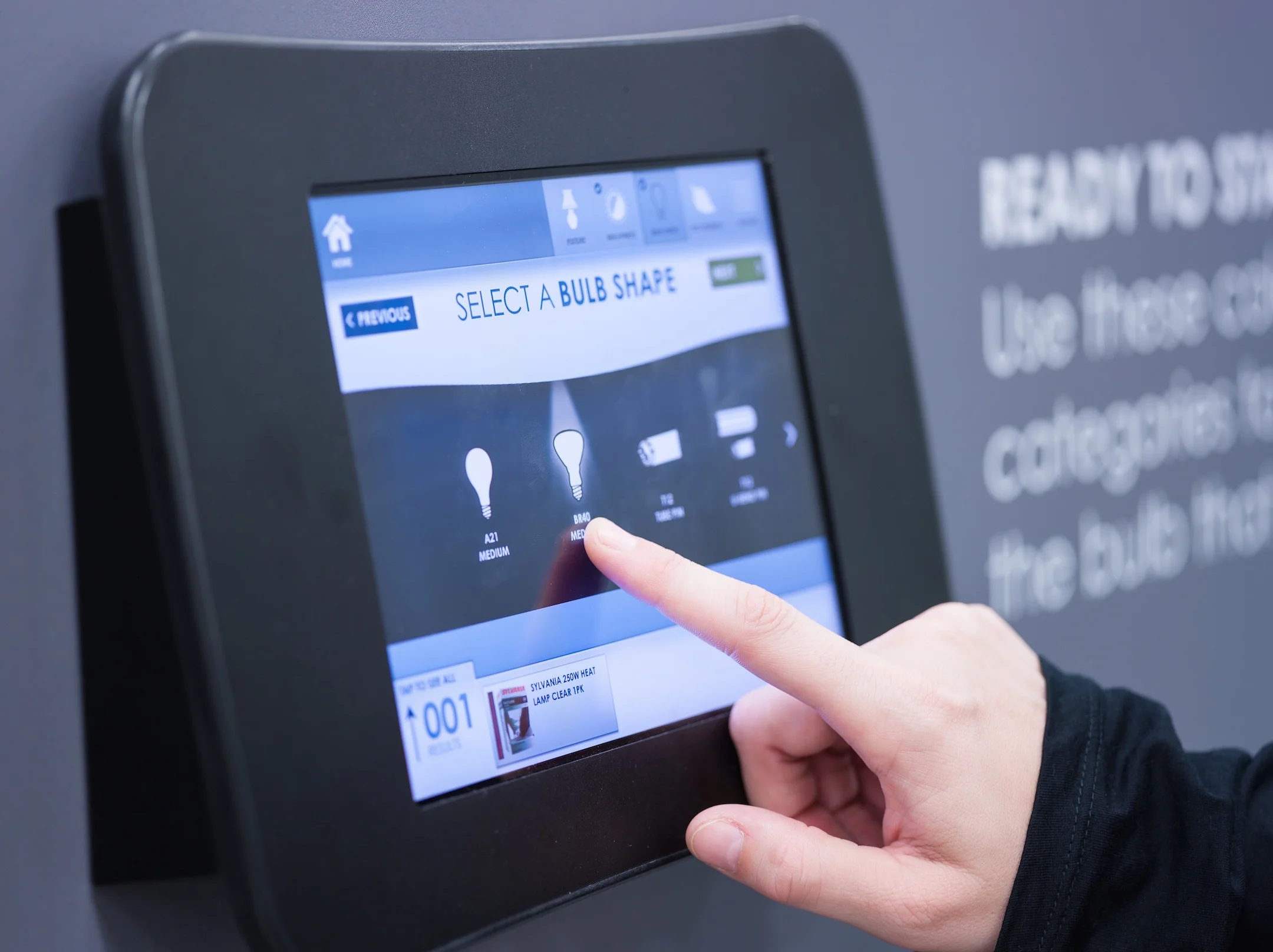
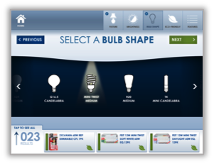
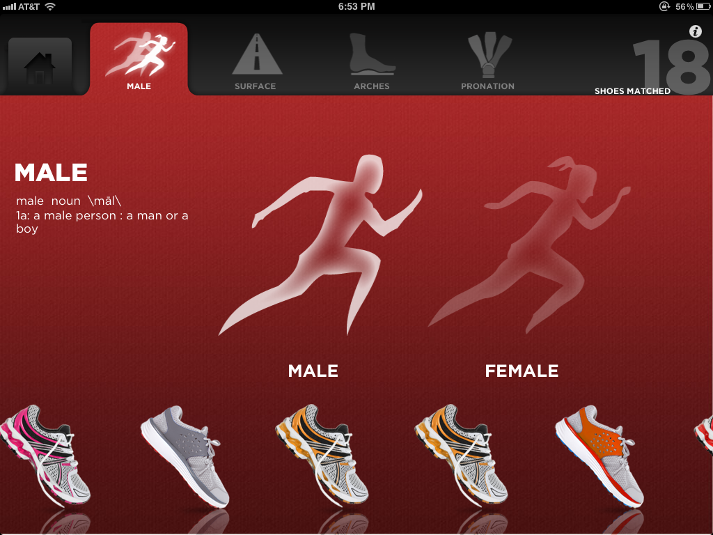
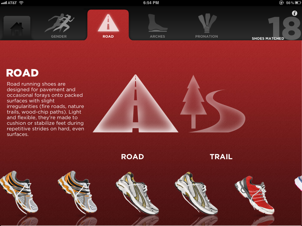
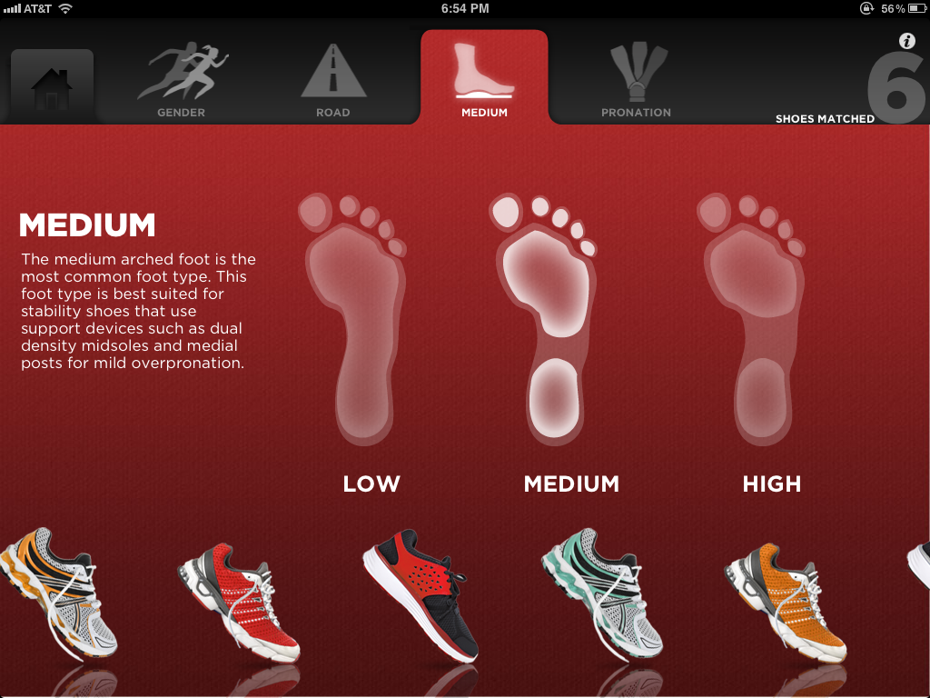
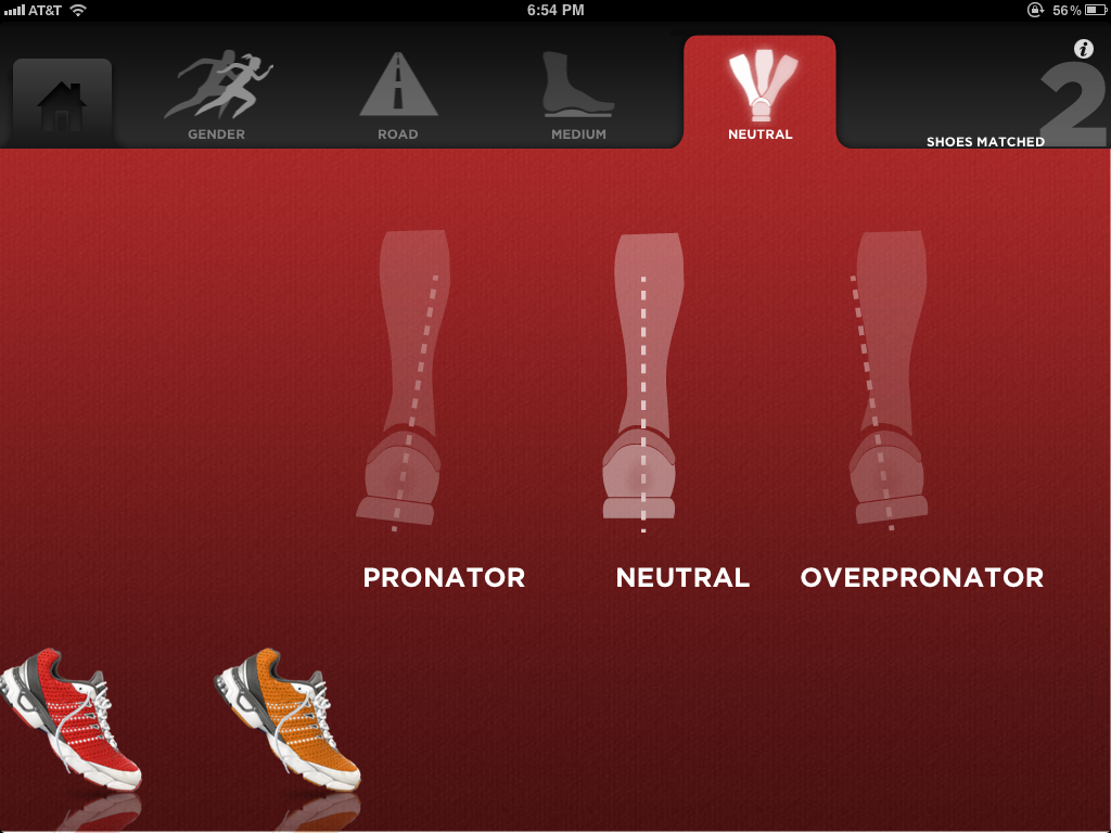
Still with me? Below is an example of how we build our shopping apps, so that customers very quickly and intuitively filter through a massive inventory and find the best match.
Tips: Always keep your choices to four or fewer. And make your first question a no brainer.

*Human Kiosk Design is a phrase I coined that links UX/UI design with proxemics, the study of human spatial relationships. This is specifically relevant in the new omni-channel age as retailers bring the best aspects of online and mobile into the brick-and-mortar environment.
